Quantifying the Loss of Rapid Transit on Chicago's South Side
Chicago Transit GIS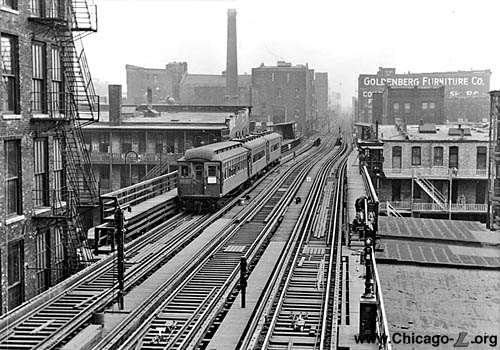
The 18th Street station of the South Side Elevated, closed August 1, 1949. Courtesy: www.Chicago-L.org
For the UChicago Spring 2024 GIS Practicum Course I undertook the following research project on the loss of rapid transit access on Chicago’s South Side. The course required we analyze an aspect of the 1950s Urban Renewal movement in Chicago, and I decided to research how changes to public transit infrastructure in that era impacted the South Side. What follows is a (slightly) abbrieviated version of that research project. Full code for the analytical methods described is available here.
Introduction
One of the regions that has experienced the most turmoil, growth, and subsequent decay in Chicago’s near 200-year history is the city’s South Side. The area is home to the city’s first elevated rapid transit line, the South Side Elevated, a line which has also changed considerably since it was created in the late 1800s.[1] In many ways, the history of the South Side “L” mirrors that of the neighborhoods it runs through – once a popular line with regular stops and service, it declined significantly throughout the second half of the 20th century. To fully understand the history of the South Side, it is important to consider how access to public transit has been transformed there, and how the South Side L has changed since its inception.
Population first boomed in the South Side following the 1871 Great Chicago Fire – the region enjoyed rapid expansion as people fled the destroyed city center, and industry began to take hold south of the downtown Loop area.[2] The 1893 World’s Columbian Exposition in the South Side’s Jackson Park attracted significant further investment and activity, and The University of Chicago’s establishment in the Hyde Park neighborhood further fueled development.
Numerous ethnic groups established communities in the South Side in this period, including middle-class Irish, Roman and German Catholics, German and Eastern European Jews, German Protestants, Poles, and more. However, the South Side is most ethnically associated with African American Blacks, who moved to the region in droves in the 1920s during the Great Migration. Residential segregation caused Black people to be confined to a specific geographic area – originally only in a narrow strip South of the Loop between State St and Wentworth Ave, but eventually further south toward Garfield Blvd., Grand Blvd., and Washington Park, and east to Cottage Grove Blvd. This area was known as the “Black Belt” and was bordered on the east and west by predominantly White middle/working-class neighborhoods. The Black Belt thrived in the 1920s and 30s, as the area near the intersections of 35th/State Streets and 47th St/Grand Blvd transformed into what was known as the Black Metropolis. Businesses boomed as the corridor became the “institutional, social, cultural, and economic center of black urban life.”[3]
One of the main features of the South Side’s success at this time was its connectedness to the rest of the city via public transit. A vast streetcar grid network enabled quick, frequent street travel, and the South Side Elevated allowed for even faster north-south service between the Loop and Jackson Park. The line ran south from the Loop near State Street, before turning east briefly at 40th St and continuing back south between Prairie and Calumet Aves. The South Side L also had multiple offshoots in the first half of the 20th century, with branches toward Kenwood, the Chicago Stock Yards, Englewood, and Normal Park all built between 1905 and 1908.[4]
In the middle of the 20th Century, like many urban areas across the country, the South Side was transformed via Urban Renewal initiatives. With the stated goal of addressing perceived problems such as inadequate housing stock, declining infrastructure, and impoverished neighborhoods, U.S. Congress passed the Housing Act of 1949, which provided $1 billion in loans for slum clearance and urban redevelopment.[5] Several urban renewal projects were implemented in the South Side in the following years, including massive projects in Kenwood/Hyde Park, Englewood, and Lake Meadows. These tore down existing housing stock and neighborhoods, replacing them with educational institutions, public housing, and often simply vacant lots. The National Interstate and Defense Highways Act of 1956 also led to a massive transformation in the South Side, as it preempted the construction of the Dan Ryan Expressway that tore a massive scar through the area.[6]
While Urban Renewal was transforming the South Side, transit in Chicago was also undergoing a massive change. Chicago’s public transit system was operated by private companies from its inception until the 1940s, when a myriad of problems motivated the State of Illinois to step in and establish the Chicago Transit Authority in 1947. The CTA took over all “L” and streetcar operations and began a campaign to restructure and modernize the system.[7] The main strategy was to close stations and lines which had low ridership or were perceived as uneconomical. By 1960, 25 percent of the rapid transit system had been abandoned, and the entire streetcar system was converted to motor bus routes.[8] The cuts to rapid transit were especially felt on the South Side Elevated, which lost the Normal Park Branch when it was discontinued in 1954 and the Stock Yards and Kenwood Branches in 1957.[9] Numerous stops on the remaining line were also closed in this short period, many of which were close to urban renewal projects in the Near South Side and Bronzeville areas.
These closures created several “transit deserts” across areas previously served by the South Side L and were a precursor to further shrinkages of Chicago’s original elevated line’s footprint in the following decades. In the same period there were also massive shifts in racial makeup across the South Side, as well an overall decrease of population and economic prosperity. Given the impact that public transit and the lack of it can have on the success of neighborhoods and communities[10], it is highly pertinent to study how access to rapid transit stations and lines on the South Side has changed since the CTA’s original modernization campaign.
To study these changes, I take advantage of information from the OpenStreetMap project,[11] historical Census demographic data, and historical maps. I use this data and routing algorithms to construct estimates of travel times to the nearest rapid transit stations across the South Side at several points in time, including 1940 (pre-CTA consolidation), 1960 (post-CTA modernization), and 2020 (present day). I also calculate measures of changes in population and race between these periods to study how demographic shifts coincided with changes in access to the CTA. Finally I apply spatial optimization techniques to determine the best candidate stations to return to the South Side L if CTA were to reopen stations as infill and/or re-extend the line to some of its original footprint.
In total, this research outlines the changes in access to rapid transit across Chicago’s South Side due to policy and infrastructure decisions, examines how those shifts relate to socioeconomic and demographic factors across the region, and how the impacts could be best mitigated through CTA re-investment in the South Side.
Data and Methods
The area of relevance for this research is Chicago’s South Side, which is defined roughly by Roosevelt Ave to the north, the city limits in the south, Lake Michigan to the east and Western Ave to the west.[12] Following Urban Renewal interventions that decimated dense, thriving neighborhoods in the area and the construction of the Dan Ryan Expressway in the 1950s, the South Side has been transformed from a region of economic success to one of the most economically challenged areas of the city, with poverty rates skyrocketing in the second half of the 20th century.[13] The population has also declined sharply between 1940 and 2020, as seen in the map of population change by block below:
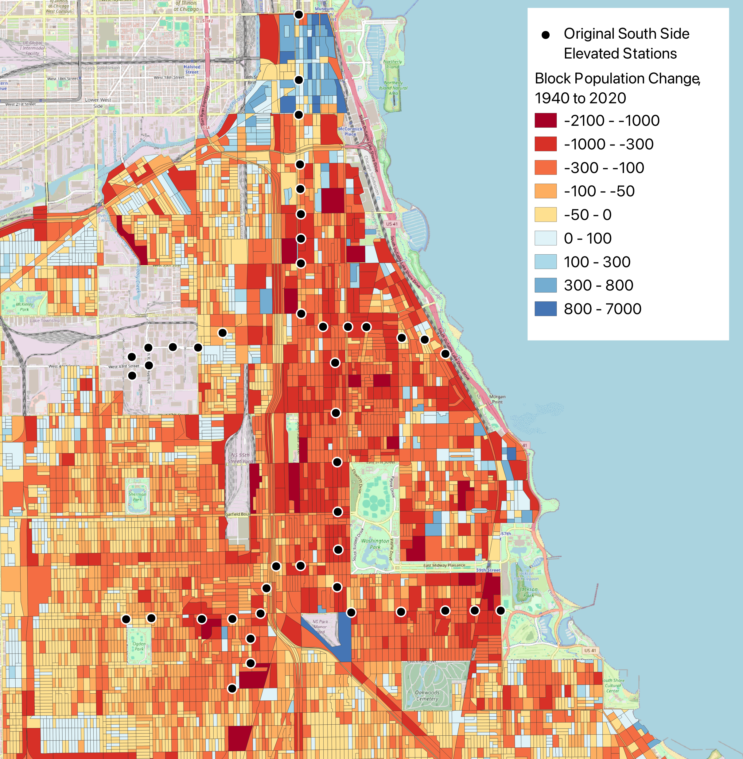
Figure 1- Changes in population between 1940 and 2020, Chicago’s South Side
Within the same period access to rapid transit has decreased sharply in the South Side. The Urban Renewal-era branch and station closures were the start of a half-century period where CTA slowly cut back the footprint of the South Side L, culminating with a two-year closure of the Green Line in the 1990s, after which many stations did not reopen.[14] [15] [16] While the introduction of Red and Orange Line service to the region has helped more people access the CTA in certain sections of the South Side, many sections remain transit islands. This research is focused on the impacts of branch and station removals across the South Side and looks to understand exactly how transit accessibility changed due to them.
The first tranche of data utilized in this work provides information on Chicago’s transit system on the South Side, both before and after urban renewal/CTA modernization of the 1950s. Locations of the branches and stops of the South Side Elevated line in 1941 are taken from a 1941 map of the entire transit system in Chicago.[17] Current CTA transit lines are obtained via the CTA’s data portal and are ingested as shapefiles to be compatible with other geographic sources.[18]
To study how demographics relate to the change in transit accessibility on the South Side I also use data from the US Census from both 1940 and 2020, which have both information on race and population.[19] The 1940 Census is measured at the Census Tract level, and only reports White and Non-White populations. The 2020 Census is measured at the more granular Census Block level and has a race breakdown comprised of the following values: White alone, Black or African American alone, Indian and Alaska Native alone, Asian alone, Native Hawaiian and Other Pacific Islander alone, Other Race alone, and Two or More Races. I also utilize geographic shapefiles for both the 1940 Census Tracts and 2020 Census Blocks, which allow for this demographic information to be incorporated in spatial analyses.
To prepare the ingested data for analysis several steps are taken. The first task is to limit the geographic scope of the Census Blocks being studied. As this research’s area of interest is Chicago’s South Side, it is important to only include Census Blocks within this region. Two different approaches will be taken to limit the geographic scope. First, when studying the effect of the initial closures of the South Side Elevated in the 1950s, the blocks studied are those within a convex bounding box of all blocks that are within a 30 min walk from an original South Side Elevated station. Second, when comparing overall access to transit on the South Side between 1940 and present, I consider all Census Blocks in the City of Chicago south of Roosevelt Ave and the Chicago River and east of Western Ave. I also remove Census Blocks that are not utilized for housing, which are identified via a 1930s land use map which designates park lands, industrial lands, and rail yards.[20]
Another step is to georeference the original 1941 transit map. This is completed in QGIS via the software’s Georeferencer tool, using the Polynomial 3 transformation type and Nearest Neighbor resampling method. The Polynomial 3 transformation is used to account for warping and inconsistencies in the 80+ year old map while largely maintaining parallel lines. After georeferencing, a shapefile is manually created to identify the South Side Elevated stops in 1941.
To resolve the differences in granularity between the 1940 and 2020 Censuses I implement an aerial interpolation approach. To measure the demographic changes between 1940 and 2020, the measures from 1940 must be estimated into the smaller block levels. This is done via a process in which the intersections of the blocks and tracts are calculated, and proportions of the populations and race counts equal to the proportion of the geographic area of each block that lies within each tract are assigned to proxy the 1940 demographic estimates at the block level.
Rather than consider distances to rapid transit as Euclidian distances, it is more helpful to consider travel time. To calculate these times I employ the r5py Python package.[21] R5py utilizes street network information from OpenStreetMap and a routing algorithm to calculate travel times between two points. It also supports GTFS data, the industry standard for transit schedules. Using street networks based on OSM data, transit schedules, and its routing engine, r5py can calculate the travel time between any two points at a given time via any combination of walking and transit.
I calculate the walking distance between the centroid of each 2020 Census Block and all rapid transit stops and keep the path with the shortest travel time as a measure of each block’s accessibility to the CTA. I also calculate these travel times between each block and the 2020 CTA stops. This method of calculating catchment areas is simpler than the commonly used two-step floating catchment area method,[22] as I make the generalizing assumption that having access to more than one South Side L stop is no more useful than being close to one.
Finally, my analytical approach to study the impact of the loss of transit infrastructure in Chicago’s South Side is as follows: First I measure a simple difference in the proportion of people in the South Side who lived within a 10, 15, and 20-minute walk of the South Side L before and after the CTA modernization of the 1950s. I also map these differences spatially.
I then run a regression model where each observation is a Census Block, and the dependent variable is difference in travel time to rapid transit before CTA modernization and after. Independent variables include 1940 interpolated population per block and non-White population percentage. This regression tests the hypothesis that race and population had no effect on which areas had their travel time to rapid transit increased by CTA modernization. I also construct a regression model where each observation is a Census Block, and the dependent variable is change in travel time to rapid transit between 1940 and current. Independent variables include the change in population per block and change in non-White population between the two Censuses.
Finally, I conduct a spatial optimization exercise to determine which would be the best candidate sites to reopen previously closed South Side L stations. To do this I calculate the travel time from each block to each closed station and identify the candidate stations that would give the most South Siders quick access to CTA rapid transit using 2020 Census Block populations and the Maximal Coverage Location Problem framework.[23]
Results
The modernization campaign undertaken by the CTA in the 1950s had immediate and dramatic effects on access to rapid transit in the South Side. Within a convex bounding box of all blocks within a 30 min walk from an original South Side Elevated station, the percentage of population within quick walking distance of the L declined sharply:
| Time Threshold | % of Population Within Threshold Pre-CTA Modernization | % of Population Within Threshold Post-CTA Modernization |
|---|---|---|
| 10 min | 32% | 24% |
| 15 min | 50% | 38% |
| 20 min | 65% | 50% |
These changes are visualized below:
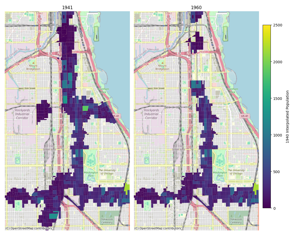
Figure 2- Census Blocks within a 10-minute walk of rapid transit, colored by 1940 population
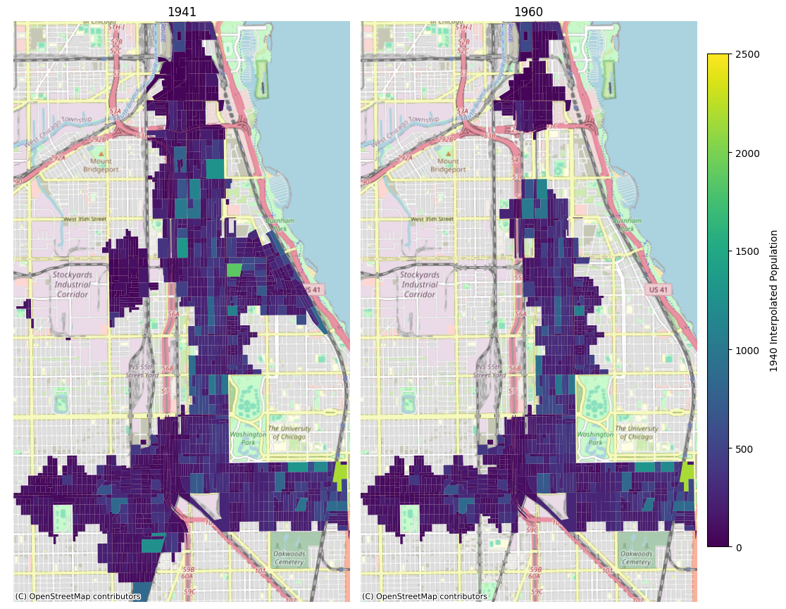
Figure 3- Census Blocks within a 15-minute walk of rapid transit, colored by 1940 population
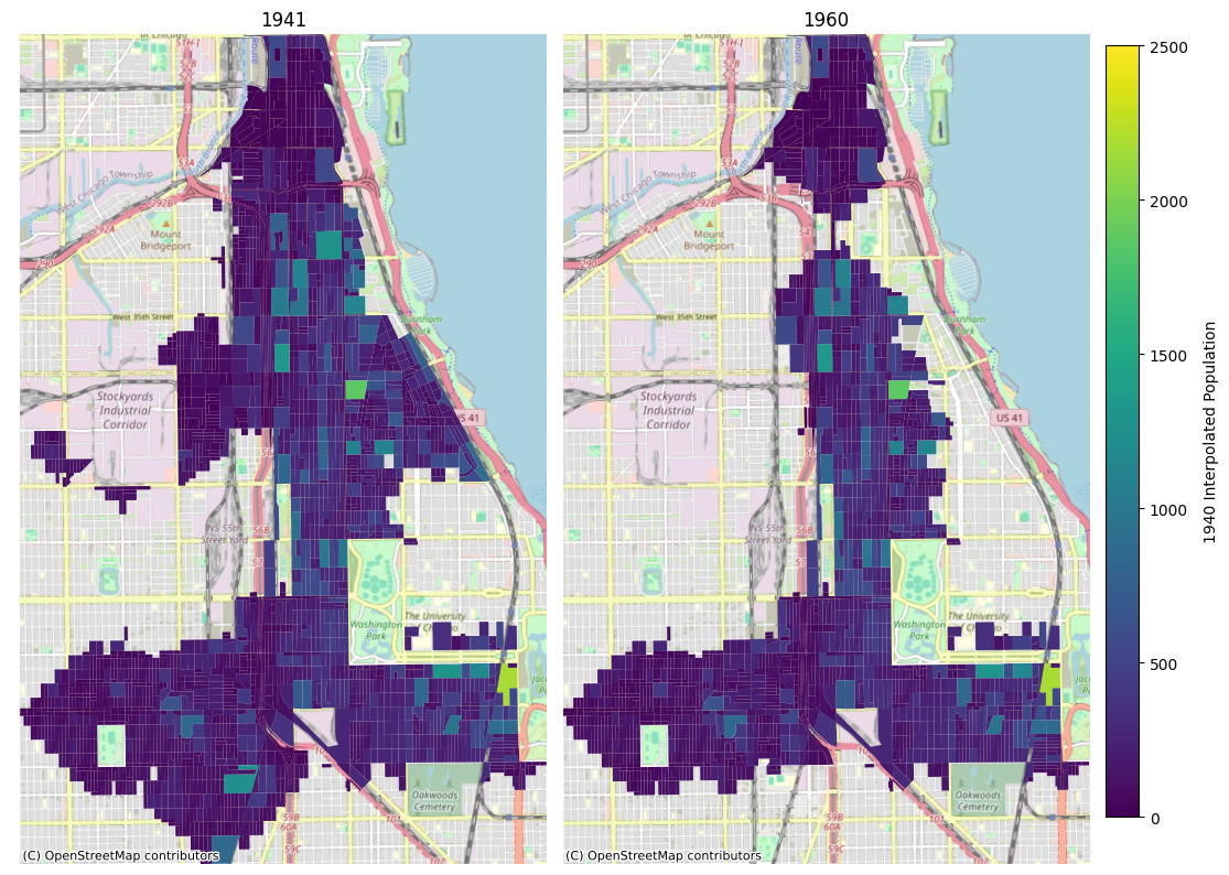
Figure 4- Census Blocks within a 20-minute walk of rapid transit, colored by 1940 population
Immediate access to rapid transit in the Stock Yards, Normal Park, and Kenwood were all destroyed, and walking times increased by 10-20+ min across Bronzeville, even though the line still ran straight through the neighborhood. The maps also indicate that the closed stations were not necessarily in areas devoid of population, a finding that stands in contrast to CTA’s justification for the closures – that they were done in areas that would not be profitable. The blocks within immediate walking distance of Kenwood and Normal Park were not huge population centers but had similar populations to the rest of the area served by the line. The Stock Yards were also declining from their boom in the prior decades, but would not be shut down officially until 1971, at which point the area was converted to a successful industrial park.[24]
I next examine potential links between the loss of rapid transit access and race/population via regression analysis. First, I consider changes in travel time due to CTA modernization and include 1940 interpolated population per block and non-White population percentage as dependent variables. This model is estimated for all blocks that fall inside a convex bounding box of all block centroids within a 30 min walk from an original South Side Elevated station.
| Variable | Coefficient | Std. Error | t-Statistic | Probability |
|---|---|---|---|---|
| Constant | 1.19629 | 0.02624 | 45.58911 | 0.00000 |
| 1940 Percent Non-White | -0.00430 | 0.00053 | -8.06872 | 0.00000 |
| 1940 Population | -0.00032 | 0.00011 | -2.89043 | 0.00387 |
The results indicate that interpolated Census blocks which were Whiter and had lower populations were more likely to have a higher percent change to their travel times to a rapid transit station from before to after CTA modernization. This finding is explainable by the maps below: While the highly non-White and populated blocks in Bronzeville did considerably lose access to transit, the lower population and heavily White blocks near the Normal Park, Kenwood, and Stock Yards branches make up a much higher percentage of the blocks whose travel times to rapid transit increased. The blocks which were closest to the Stock Yards specifically skew these results, as almost the entire (mostly White) southwestern side became a transit desert.
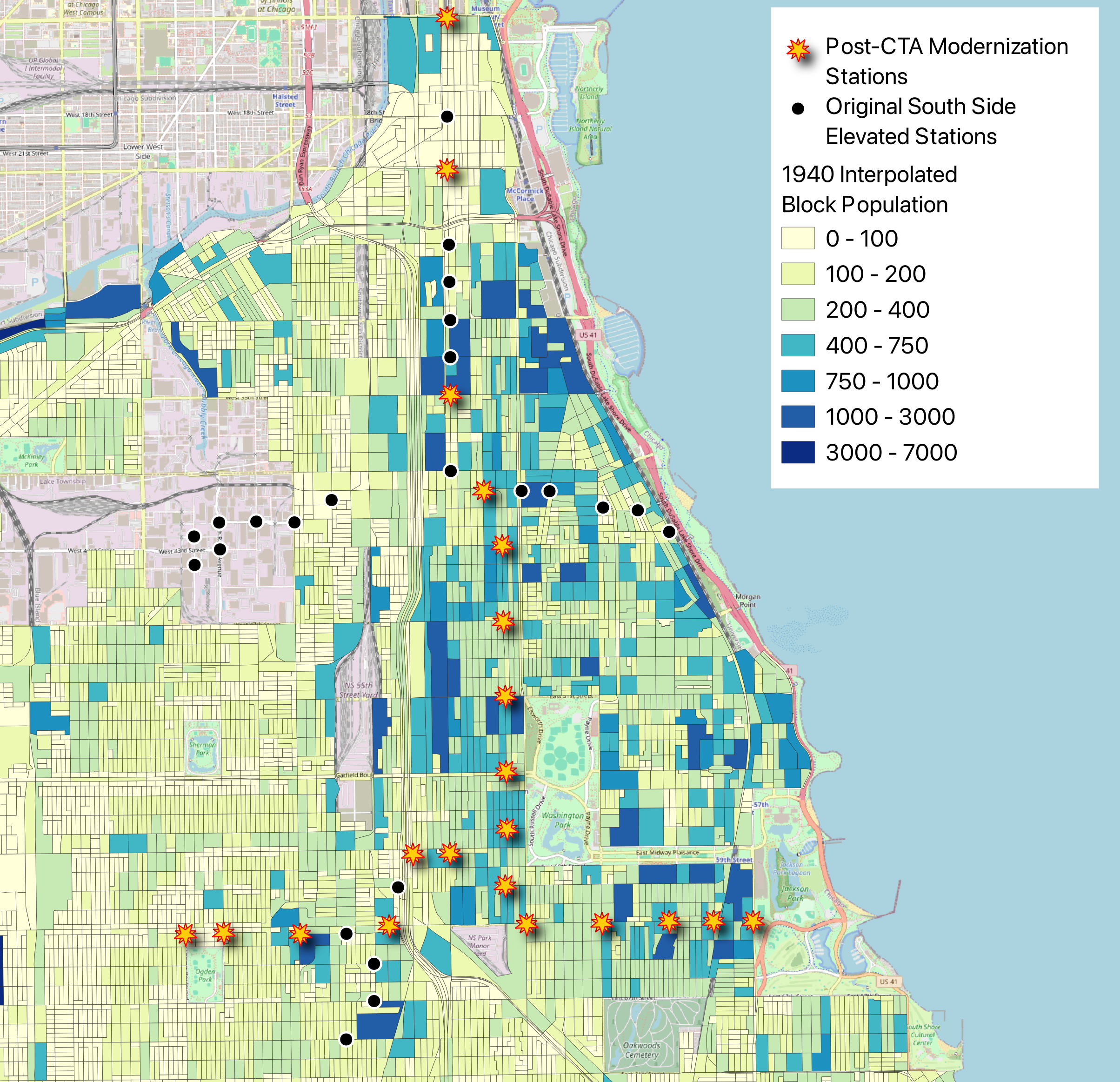
Figure 5 - Interpolated population per Census Block, 1940
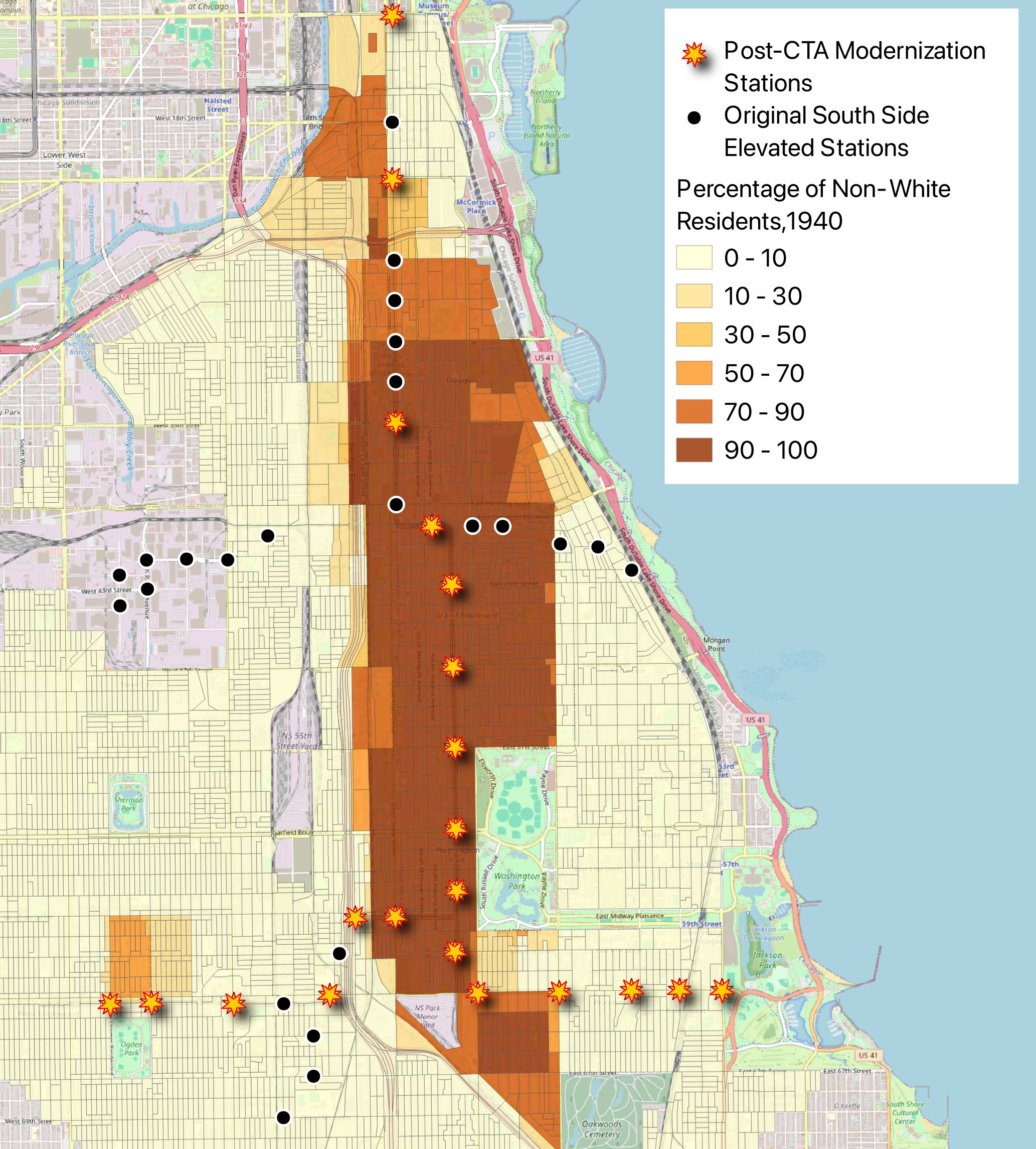
Figure 6 - Interpolated percentage of non-White residents per Census Block, 1940
The next hypothesis I examine is whether changes in access to rapid transit on the South Side between 1940 and present are correlated with race and population changes across the same period. A regression model is estimated with the change in travel time as the dependent variable is, and percent change in population per block and percent change in non-White population between the two Censuses as explanatory variables. This model includes all Blocks south of Roosevelt Ave and the Chicago River and east of Western Ave.
| Variable | Coefficient | Std. Error | t-Statistic | Probability |
|---|---|---|---|---|
| Constant | 3.69986 | 0.00652 | 567.60716 | 0.00000 |
| Percent Change in Non-White Percentage, 1940 to 2020 | -0.00072 | 0.00015 | -4.72263 | 0.00000 |
| Percent Change in Population, 1940 to 2020 | -0.00009 | 0.00003 | -2.84902 | 0.00441 |
The results indicate that Census Blocks which became more diverse and had more population growth were impacted less by a decrease in transit access between 1940 and present. The causality here is difficult to interpret – blocks which decreased in population almost certainly did so in part due to less access to transit, while CTA also closed stations in places where population was declining. Almost the entire South Side was also becoming more diverse in this period, and as such, percent change per Census Block may not be the best way to measure changes in race regarding this question. The overall picture painted by the regressions is a muddy one – this is simply too complex of an issue to distill to percent changes and linear regression.
Considering the overall shifts in rapid transit access between 1940 and present, walking times to CTA rail stations have fluctuated greatly across the South Side. Further station closures on the Green Line have made it even more difficult to access the CTA, while the introduction of red and orange line service has also improved access for many communities, as seen below:
Figure 7 - Change in walking time to nearest CTA stations between 1940 and 2020
If the CTA were to address some of the areas where it has become harder to access Chicago’s rapid transit system since 1940, a potentially easy solution would be to reopen some of the previously closed stations on the South side. With over 30 stations closed from what made up the original SSL, there are many candidate locations for the CTA to re-establish service and provide easy transit to the red-highlighted regions of the map above.
Determining the best stations to reopen can be accomplished via the Maximal Coverage Location Problem framework, a form of spatial optimization. Using a Gurobi optimizer,[25] I implement MCLP to determine which re-instituted station would cover the most people within a 10-minute walk that are not already living within that time threshold of a station. First, I consider only reopening stations that would not require re-building any track, in other words, sections of the Green Line that currently exist, but the stop there has been closed. The optimization algorithm determines that the optimal location would be the 18th Street Station on the Green Line, which was closed in 1949 during CTA modernization.[26] The station was previously considered for re-instatement in the early 2000s, but a new station two blocks south at Cermak Rd was re-instated instead. Despite the Cermak station, there are still a significant number of South Loop residents who live north of the station and would be best served by another station at 18th – over 6,800 people new would live within a 10-minute walk of a CTA station if 18th Street were re-instated. The second-best candidate station would be at 61st Street, which was built in 1892 for the 1893 World’s Fair and removed from service in 1994, as it closed for the Green Line closure and never reopened.[27] The third-best infill station would be at 31st Street, another one of the stations that closed in 1949 as part of CTA modernization efforts.[28] 61st and 31st Street Stations would bring an additional 4,100+ and 3,700+ people within a 10-minute walk of a station, respectively. With these three stations re-instated, nearly 15,000 people in total would newly live within immediate access of a CTA station.
I also consider which stations would serve the most people if the Green Line’s branches were also able to be rebuilt. The optimal stop to re-establish on a branch is the University Station along the Jackson Park branch, which was cut back to Cottage Grove following the 1990s Green Line closure. [29] The next best two stations to re-instate are on the Kenwood Branch, at Vincennes and Ellis-Lake Park. With these three additional stations over 14,000 people would be newly covered by CTA rail.
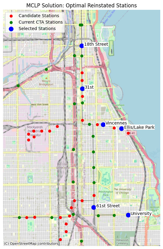
Figure 8 - Optimal stations for re-instatement of CTA service, as determined through MLCP optimization
This MLCP analysis shows just how detrimental station closures have been on the South Side, and how re-investment in the area could reap massive rewards in ridership for CTA.
Discussion and Conclusions
The history of Chicago’s South Side is winding and complex, and this research only covers briefly on one key component’s history – rapid transit. However, this research does reveal the vast amount of potential that the South Side has in terms of increasing rapid transit access. A significant portion of the South Side is not served by CTA rail, and additional stations, lines, branches, and service frequency would be a helpful addition to many neighborhoods from which it is difficult to access the rest of the city via transit. A good start would be to implement infill stations as suggested in this research – restoring service to infill stations like 18th Street, 31st Street, 61st Street and more would provide thousands of people access to the CTA’s vast rapid transit network at the relatively small cost of additional stopping time and reconstructing the old stations.
Further analysis would be valuable to consider exactly which potential station re-openings would be best from an equity perspective – this work only touched briefly on the interactions between race, population change, and transit access. Equity measures could be implemented in the MLCP objective function to potentially address those concerns.
In the next iteration of this research, I would also like to examine how multi-modal transit plays into the dynamics studied here. Many parts of the South Side may not have been originally close to a rapid transit system but may have been close to a streetcar that quickly and reliably connected to a South Side L stop. This would require gathering more information on streetcar schedules and frequencies in the pre-CTA modernization era, and generating artificial GTFS feeds that correspond to those historical levels of service to use in multi-modal routing algorithms. Luckily in Chicago this would not require much work regarding changing bus/streetcar routes, as the CTA has kept almost all the original streetcar routes as bus lines, albeit with less frequency than in the decades before the rise of the personal automobile.
Further research also needs to be done into the history of transit frequencies and headways since CTA’s consolidation – this work only studies access to rapid transit stations but does not touch a second critical component of the efficacy of transit, how often transit cars are running.
In conclusion, this work highlights and examines one component of Chicago’s South Side’s transformation since the Urban Renewal-era – access to rapid transit – and shows through spatial data analysis how that decline has impacted neighborhoods across the region.
Sources
[1] “Chicago ‘“L”’.Org: History - The Original ‘ “L”’ Lines.” https://www.chicago-l.org/history/4line.html#South.
[2] “Chicago History Encyclopedia: South Side.” http://www.encyclopedia.chicagohistory.org/pages/1177.html.
[3] “Chicago History Encyclopedia: South Side.” http://www.encyclopedia.chicagohistory.org/pages/1177.html.
[4] “Chicago ‘“L”’.Org: History - The Original ‘ “L”’ Lines.” Accessed May 21, 2024. https://www.chicago-l.org/history/4line.html#South.
[5] “Urban Renewal, 1950-1966.” https://dsl.richmond.edu/panorama/renewal/#view=0/0/1&viz=cartogram&text=defining.
[6] SEGREGATION BY DESIGN. “Dan Ryan Expressway.” https://www.segregationbydesign.com/chicago/dan-ryan-expressway.
[7] “Chicago ‘“L”’.Org: History - The CTA Is Created (1947).” https://www.chicago-l.org/history/CTA1.html.
[8] “Chicago ‘“L”’.Org: History - The CTA Takes Over (1947-1970).” https://www.chicago-l.org/history/CTA2.html.
[9] “Chicago ‘“L”’.Org: Operations - Lines -> Kenwood” https://www.chicago-l.org/operations/lines/kenwood.html. ; “Chicago ‘“L”’.Org: Operations - Lines -> Normal Park” https://www.chicago-l.org/operations/lines/normalpark.html ; “Chicago ‘“L”’.Org: Operations - Lines -> Stock Yards. https://www.chicago-l.org/operations/lines/stockyards.html”
[10] “Transportation Access | Urban Institute | Upward Mobility Initiative.” https://upward-mobility.urban.org/transportation-access
[11] OpenStreetMap contributors, “Planet Dump Retrieved from Https://Planet.Osm.Org.”
[12] “Chicago History Encyclopedia: South Side.” http://www.encyclopedia.chicagohistory.org/pages/1177.html.
[13] “How the Geography of Poverty Changed in Chicago from 1950-2009.” https://www.chicagomag.com/Chicago-Magazine/The-312/March-2013/The-Changing-Geography-of-Poverty-in-Chicago-1950-2009/
[14] “Nycsubway.Org: CTA Green Line.” https://www.nycsubway.org/wiki/CTA_Green_Line
[15] Mason, “The Buses Don’t Stop Here Anymore.”
[16] “Chicago ‘“L”’.Org: History - The CTA (1990-Present).” https://www.chicago-l.org/history/CTA4.html.
[17] “Map of Rapid Transit Lines.”
[18] “CTA-L-Rail-Stations-Shapefile | City of Chicago | Data Portal”; “CTA - ‘L’ (Rail) Lines - Shapefile | City of Chicago | Data Portal”; “CTA - Bus Routes - Shapefile | City of Chicago | Data Portal.” https://data.cityofchicago.org/Transportation/CTA-Bus-Routes-Shapefile/d5bx-dr8z/about_data. https://data.cityofchicago.org/Transportation/CTA-L-Rail-Lines-Shapefile/53r7-y88m/about_data. https://data.cityofchicago.org/dataset/CTA-L-Rail-Stations-Shapefile/vmyy-m9qj/about_data.
[19] Manson et al., “National Historical Geographic Information System.” https://doi.org/10.18128/D050.V18.0.
[20] “Subdivided and Occupied Land in the Vicinity of Chicago.” https://catalog.lib.uchicago.edu/vufind/Record/7713241
[21] “Tutorial 2.2: Spatial Accessibility Modelling with R5py.” https://sustainability-gis.readthedocs.io/en/latest/lessons/L2/calculating-travel-time-matrices.html
[22] Takyi et al., “Measuring Spatial Accessibility of Public Libraries Using Floating Catchment Area Methods.” https://doi.org/10.1016/j.trip.2023.100944
[23] Church and ReVelle, “The Maximal Covering Location Problem.” https://doi.org/10.1007/BF01942293
[24] Pacyga, “Union Stock Yard.” https://encyclopedia.chicagohistory.org/pages/2218.html
[25] Gurobi Optimization, LLC, “Gurobi Optimizer Reference Manual.” https://www.gurobi.com
[26] “Chicago ‘“L”’.Org: Stations - 18th.” https://www.chicago-l.org/stations/18th-wabash.html
[27] “Chicago ‘“L”’.Org: Stations - 61st.” https://www.chicago-l.org/stations/61st.html
[28] “Chicago ‘“L”’.Org: Stations - 31st Street.” https://www.chicago-l.org/stations/31st.html
[29] “Chicago ‘“L”’.Org: Stations - University.” https://www.chicago-l.org/stations/university.html